When someone scrolls through a list of workshops, the first thing that grabs them isn't the title: it's the image. In a split second, the cover photo decides whether someone stops on your workshop or moves on. You can have the most beautiful description in the world, but if the cover doesn't catch the eye, no one will ever read it. Getting the main image right is one of the most rewarding investments you can make in your workshop.
It's an almost unconscious mechanism: we scroll through dozens of options in seconds, and the eye stops only on what visually draws it in. Everything is decided in that split second. Which means the cover photo isn't an aesthetic 'nice-to-have' — it's the real entry ticket to your workshop: without a good image, everything else — title, description, reviews — won't even get a chance to come into play.
What makes a cover work
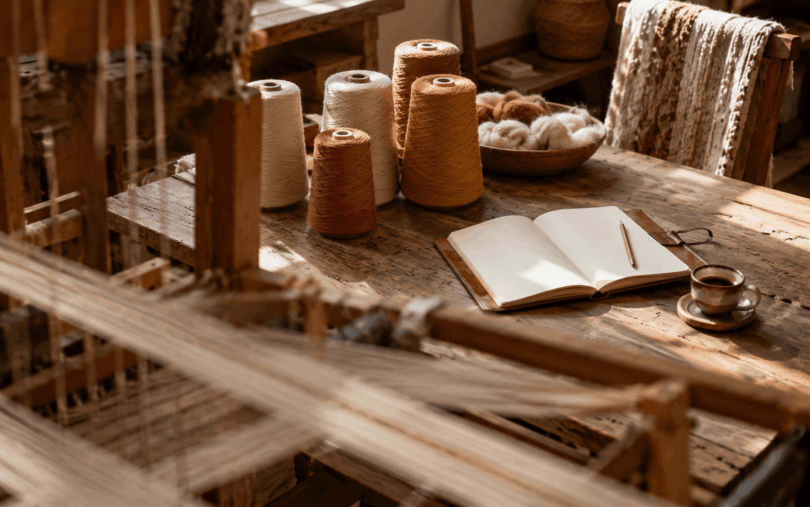
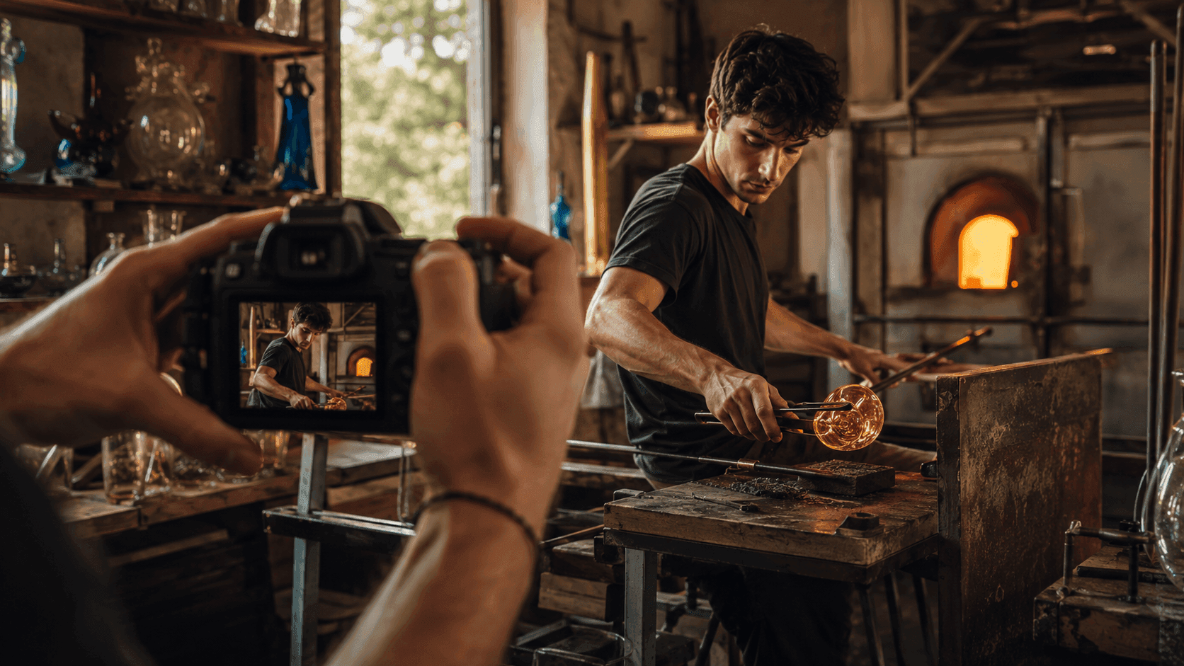
- Show the experience, not just the finished product: hands at work, people involved, the gesture in action. It's the action that makes someone think 'that could be me'.
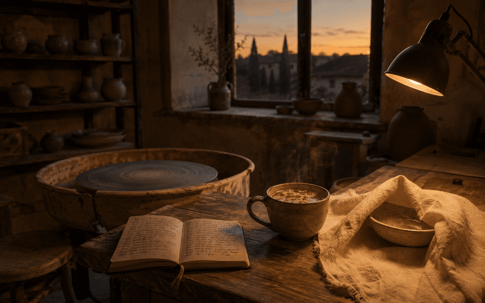
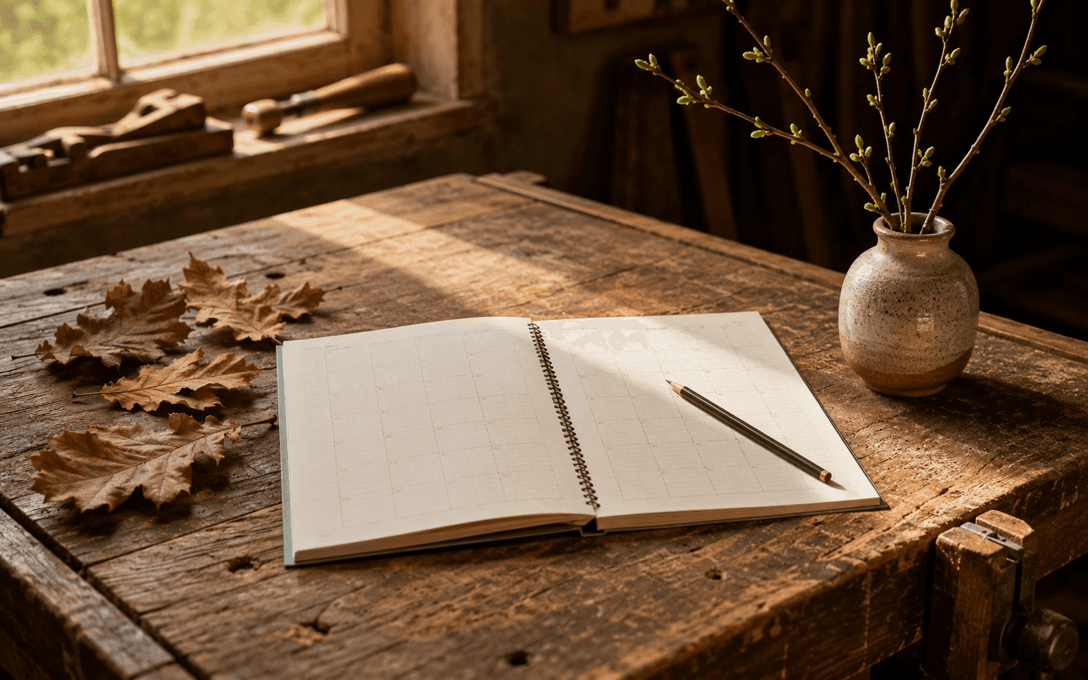
- Natural, warm light: bright photos draw far more attention than dark, flat ones.
- A clear, clean subject: avoid crowded or cluttered images where the eye doesn't know where to look.
- Colours and atmosphere that match the real experience: the photo has to promise what people will actually find.
Hands, faces and emotion sell
The images that work best for workshops tell a human story: hands kneading, shaping, sewing; faces focused or smiling; the moment of admiring the finished object. A photo of the product alone, however beautiful, says 'object for sale'; a photo of the gesture says 'experience to be lived'. It's the second one that makes people click when they're looking for something to do, not something to buy.
Avoid the mistakes that make people scroll past
Some choices make people scroll past almost automatically: dark or backlit photos, grainy or blurry images, crowded frames where it's unclear what the subject is. Even obviously 'stock' photos — the generic ones pulled off the internet — give off a lack of authenticity that the eye picks up instantly. The cover has to feel like yours, taken in your real space: it's precisely that authenticity that stops people looking for a genuine experience rather than an impersonal service.
Mind the format and the consistency
A well-framed, sharp cover with a clearly visible subject performs far better than a beautiful photo that's badly cropped or grainy. Aim for visual consistency across your workshops too: a recognisable style helps people 'feel' your studio before they even read who you are. The cover is the first impression: treat it as one.
Domande frequenti
- Is it better to photograph the finished product or people at work?
- People at work, almost always: hands in action and engaged faces help people picture the experience and say 'something to live'. A photo of the product alone says 'object to buy', which is a different message.
- Do I need a professional camera?
- No: a recent smartphone with good natural light is enough for great covers. The light, the framing and the moment you capture matter far more than the gear.
- Can I use photos pulled from the internet?
- It's not recommended: generic stock images strip away authenticity and the eye spots them instantly as 'catalogue' shots. People looking for a craft experience want to see your real space and your real hands, not an impersonal photo identical to a thousand others.
- How much does the cover photo really matter?
- Enormously: it's the first thing people look at and it decides whether they stop or scroll past. A good cover is what gives your description the chance to actually be read.
Create your free profile and upload photos of your experiences: a cover that catches the eye is the first step toward a booking.
Give your workshops a great cover on Handsome